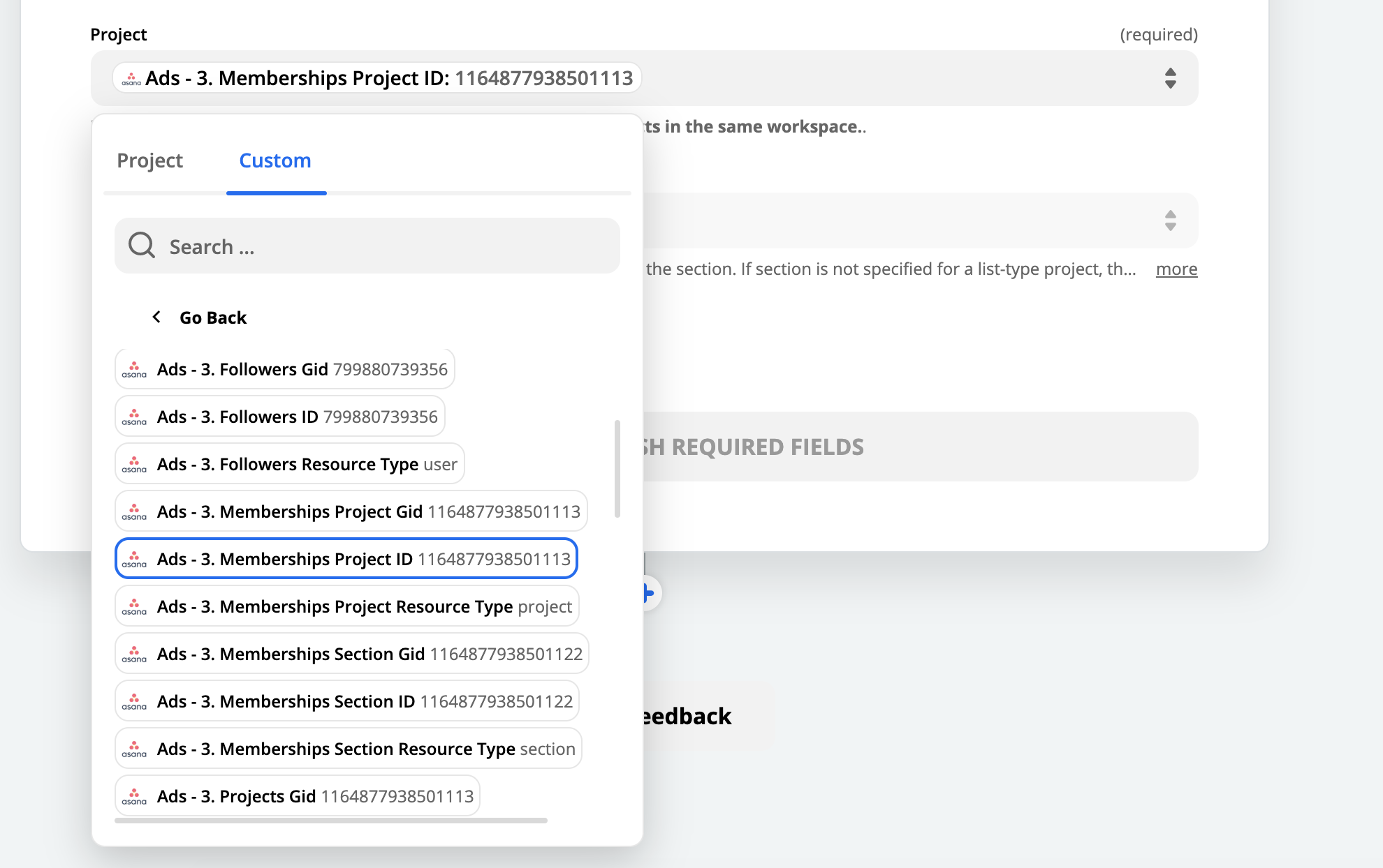
Screen Shot_2020-03-04 14.29.27_ycDFDz.pngFor a while, now, I've felt like each subsequent change has made the product worse, but they've all been tolerable. I've been able to get used to them.

But this one... this is just awful. I'm sorry.

  • It doesn't work on Safari at all.
  • It's extremely crowded, cramped, and unpleasant to use.
  • It requires multiple clicks to get to what I want ("load more" if you want anything but 1-2 options)
  • It makes it impossible to put in TRUE custom values
  • It's slow loading

I'm not one for whining, but this makes the product honestly unusable.

In one update, you've taken creating and modifying Zaps from being one of my FAVORITE things to do in my business, to one of my least favorite ones.

Please, please, switch it back immediately. Power users cannot use the product like this.


@jlevi

Fellow power users have been quite invested in reporting bugs with the new UI to Zapier and so far they've been responsive with fixing them.

I'll flag this post up to them as well.


Hi @jlevi

Thanks for your feedback here - I genuinely appreciate it. As engineering manager for the editor team it's my job to figure out how best to roll out these sorts of new features. In this post I'd like to explain:

  • The motivation behind this change
  • The release strategy we followed this time around
  • The specific fixes you can expect to land, and when.
  • How we're tweaking our release strategy going forwards.

Let's drive in 😁

Why make this change? We see a lot of users fail to set up zaps when they're new to the product. Specifically, understanding how to map fields is tricky for new folks, mainly because the fields that can be mapped are 'hidden' behind a somewhat unintuitive button. This design puts fields that can be mapped front-and-center. There's a huge range of skill levels amongst Zapier users. We want to build an editor that works well for people across that spectrum, which is precisely why this forum exists, and why we're working together to figure out how we can ensure this is a usable UX for y'all.

One of the hardest problems an engineering team faces is knowing when to release something. The 'safe' option might seem to keep a new feature internal-only until it's been thoroughly tested. However, experience has shown us that even when we do this our users we discover something new - some bug or oversight we didn't think of. This motivates us to release features earlier to a limited set of users so we can find those problems sooner and get them fixed sooner. On the other hand, we clearly don't want to cause our users pain - so some level of internal testing has to happen before an initial release. Finding the balance between those two is a challenge.

For this release we spent three weeks in internal QA. We then released to everyone in the zapier experts program (that's you!). We've also slowly been releasing to more and more users, gathering feedback through our support team. Throughout that process we've received some great feedback from folks, and you can expect fixes for the following issues to start landing next week:

  • Clicking 'all options' and 'go back' buttons closes the dialog in some browsers. Safari seems to be particularly prone to this, but Firefox and Chrome occasionally also have this problem.
  • General UI styling tweaks: the 'required' label isn't obvious enough, default text feels too heavy, and HTML links in 'copy' fields aren't distinct any more.
  • '_' characters are removed from lookup table key fields.
  • Dropdowns in lists are laggy, as they save their value to the server too aggressively.
  • Custom values are un-set when switching between 'custom' and 'normal' modes in the dropdown window, making it too easy to lose your data in these fields.
  • Pills occasionally start rendering with 'No data' instead of the chosen sample.
  • It's hard to copy values from sample fields - previously using a custom value made this possible.
  • Searching for a field should search on the field value as well as the field key.
  • In some limited cases users have to click twice to get the field-mapping dialog to show.

That's not a complete list - but it's the high-level items we've prioritised right now. I'll continue to keep the announcement thread (https://community.zapier.com/discussion/comment/2683/) up to date as these fixes get rolled out.

Going forwards we're going to ensure we have more developer capacity to respond to reported problems as they're brought to light. I won't bore you with the details, but we're short of developers this week, which is why the fixes for the above are due to land next week. We're also changing several of our internal QA practices, which should help us catch more of these sorts of issues sooner.


Finally, I'd like to thank you for your patience as we fix things up. Please continue to report issues you notice - I'm checking the announcement thread daily.


Regards,


Thank you. Thank you. Thank you. I'm so pleased I'm not the only one. I agree wholeheartedly. The latest round of design changes have made Zapier totally useless. Its like a flat screen in a car. I used to be able to turn up the bas in one step. Now it takes seven steps to do the exact same thing. All in the name of trying to be all things to all people. This interface is for developers. Stop dumbing it down.


I think that the UI redesign was a positive move in the right direction but I have my reservations. I was disappointed when I realized that it was mostly cosmetic and didn't address or improve usability and much needed functionalities that could significantly improve the UX.

A couple that come to mind are the inability to drag and drop (reorder) actions. Inability to create custom lists (i.e. Lookup Table) that can be used in multiple zaps without having to recreate a lookup table with 100 rows with every zap.


I appreciate the in-depth reply, and I will give the new interface another chance - however, you have to expand it. I'm not sure why you made the popup modal so narrow (maybe trying to help mobile friendliness?), but it makes it feel like I'm doing brain surgery in a phone booth. It's too crowded. Please expand it back...


Have to agree with the comment. The UI change makes Zapier MUCH HARDER to use efficiently. I've used it on Chrome & Firefox and have found that Zap creation requires more clicks, and takes considerably longer. #notafan


Could this have anything to do with me no longer having the ability to connect to Wordpress (probably not but I'm grasping to anything at this point)


I actually feel that overall this was a positive change in terms of UX. It makes the variable fields more accessible than before, especially for new users. My main complaint is that you almost always have to press "more". Showing the first 3 only isn't really super helpful as they are almost never the ones we're actually looking for.

There was a bug too when you click "More" if you didn't hold down on the "More" button then it would close the modal. Found that if you hold down on the button when you click it though it doesn't close.

Excited to hopefullu see future power-user features like duplicate actions and drag/drop reordering!


Hi folks,


Thanks for your patience! I wanted to update you about the progress we’ve made, and the changes we’re planning on making over the next week or so. Without further ado, here’s the list of things that have landed in production already:


  • Clicking ‘show all options’ and ‘go back’ links now works correctly in all browsers, as does toggling a dropdown field between ‘custom’ and ‘normal’ modes.
  • General UI styling tweaks: The 'required' label isn't now more obvious, default placeholder text has been made a lighter colour, and HTML links in 'copy' fields are now styled correctly.
  • ‘_’ characters are no longer removed from dictionary key fields.
  • Nothing is changed from a dropdown field when switching between ‘custom’ and ‘normal’ modes. Now field contents is only changed when you select a new value. 
  • We’ve tracked down and fixed a couple of cases where sample data started rendering inside pills as ‘No data’. We think we’ve got them all, but if anyone still sees this, please let me know.
  • You can now copy the key and value from any field in a dropdown: simply right-click on the thing you want to copy and select ‘copy’ from the menu that appears: https://zappy.zapier.com/1aeac19f86d22f16268f03df52e154cc.mp4
  • Searching for a field will now search in both the ‘key’ and ‘value’, making it easier to find what you’re looking for.
  • It’s now more obvious that you can type in a dropdown field when you’ve switched the field to ‘custom’ mode (new placeholder text added).
  • Code steps once again use a fixed width font!
  • We fixed a regression where error messages didn’t contain any useful data when a dropdown field failed to load data from the external service.
  • Fixed a race condition where filter conditions sometimes weren’t re-tested after a change.


Thank you to everyone who gave us feedback. Many of you contributed to our TODO list, and I’m really thankful for your feedback. 


However, there’s still a few tweaks we’d like to make. We’re hoping to work on the following over the next week:


  • Widen the field mapping dropdowns. We’re still considering designs here, but we’ve heard your feedback that the new dropdowns are too small.
  • Fix a bug where hitting the return/enter key while editing a dictionary field will delete the active row.
  • If there’s only one app to map from, start with that app expanded in the field mapping dropdown. Similarly, if there’s <= 3 fields, don’t show the ‘show all options’ link.
  • Show 2 lines of help text before showing the ‘show more’ link.

...along with a variety of other, smaller fixes.

Thanks again for all your feedback here - please let me know if you have any questions.


Hi everyone,


I wanted to let y’all know that the fixes above have now all landed in production. While we’ll still fix bugs that are reported, we’re switching our primary focus to other areas of the editor. You will absolutely hear from me (or someone from the editor-team) about future features again.


Thanks everyone for your patience & feedback on these changes.