
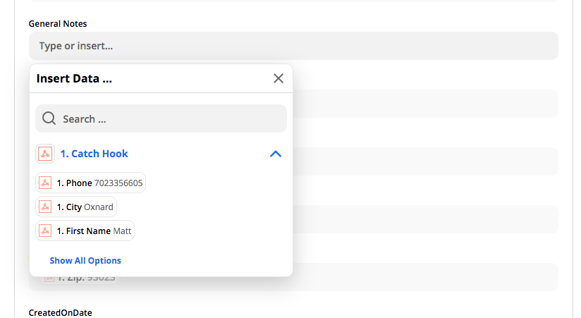
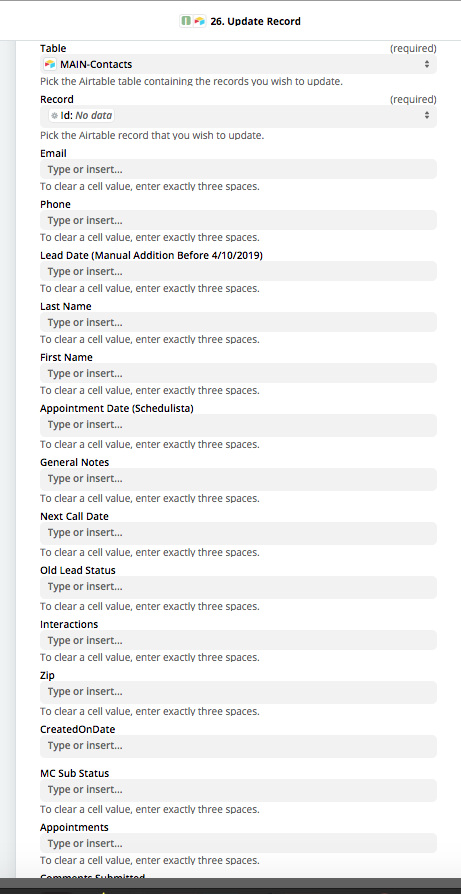
 totally mystified by this design "improvement". It makes the process longer, not shorter. I have 50+ columns so I have to click, then pick the step, then click show all. Who is this designed for? Same thing with adding "Type or insert..." in every row. WTH?? Now rather than scanning to see where the filled ones are to make changes, they all look filled. Is there anyone on the zapier planet that doesn't know to "type or insert" in an obvious form field? If so, what are they doing on zapier?
 I would like to know if other users feel the same. So far these posts just get thrown away by the admins.