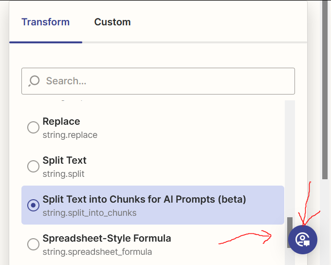
I’m using Firefox and the new editor. When the panel on right-hand size of the editor reaches the bottom of the screen, both the “Search” dropdown and the page itself have scrollbars. This makes it very clunky to get to the bottom of the list.
Also weird that the “Search” scrollbar elevator starts off very tall, but when you touch it to start scrolling, it shrinks. Sometimes more than once.
Between the dueling scrollbars and the contracting elevator, it’s very annoying to navigate lists at the bottom of the page.
As a final insult, the floating “Help” button just gets in the way. (Simple solution for that problem may be to move the button the the bottom left corner of the editor,)
This may be related to the posts below, although I am able to get to the bottom of the list, just not easily.
Tom

