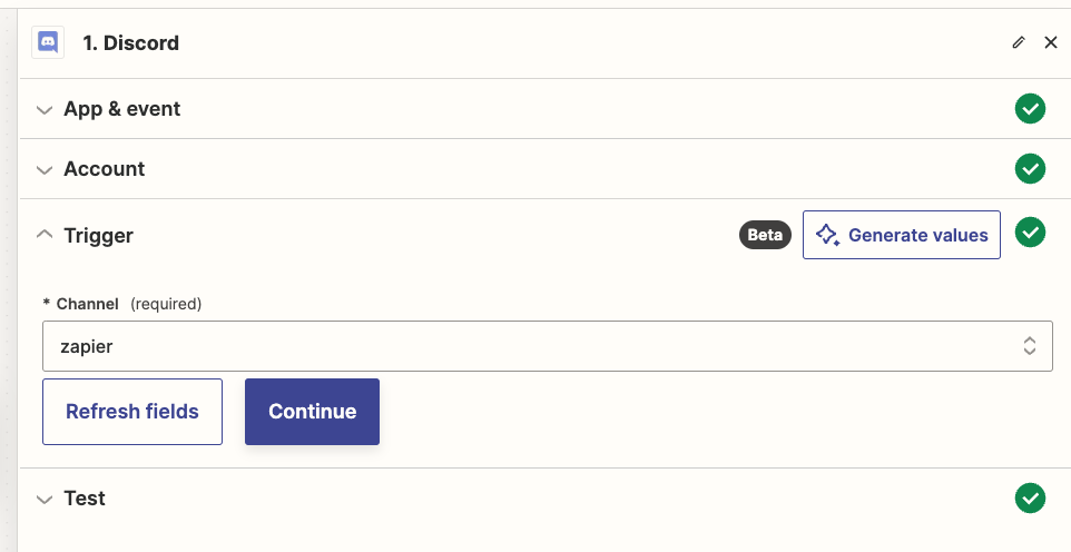
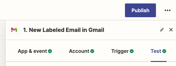
I noticed this on two different accounts and already sent a support ticket about it, and wanted to ask openly about it, for anyone else who’s noticed this: why are there two Zapier step editing layouts, and how do I switch from one to another? I prefer the horizontal one because I don’t have to keep scrolling up and down to change tabs.

Notice the position of “App & event / Account / Trigger / Test”.


VERTICAL (like accordions)
 

HORIZONTAL
 

Hi @TORLEY 

Zapier is either rolling out an updated Zap EDITOR UX or A/B testing the new Zap EDITOR UX.


@Troy Tessalone  - IS that something that can be changed? I’ve seen a few people who have the horizontal tabs, and I think I would prefer that over the vertical. 


@MikeFreeman 

This will likely continue to be rolled out in due time to all Zapier accounts.

In the meantime, you can try opening a ticket with Zapier Support: https://zapier.com/app/get-help