I want to create a Zap that whenever someone signs up on Mailchimp for our application they are sent our SurveyMonkey Application. 


The first time I tried it, it sent two emails, the first email was generic “we want your opinion email” followed by the email I created in the Email collector I was using. 


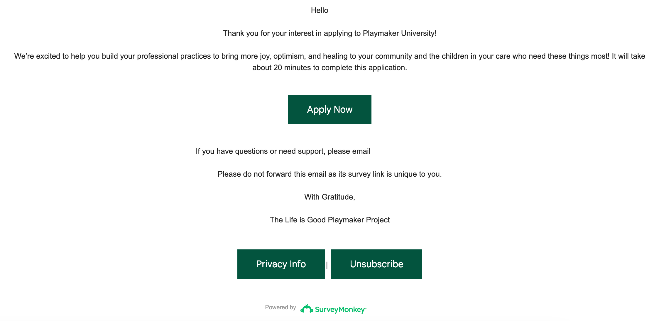
The second try just sent the email I created in the zap. But it was completely unformatted. And looked something like this


Hello REDACTED! Thank you for your interest in enrolling in REDACTED! We’re excited to help you build your professional practices to bring more joy, optimism, and healing to your community and the children in your care who need these things most! It will take about 20 minutes to complete this application. REDACTED ENTIRE TRACKABLE SURVEYMONKEY LINK If you have questions or need support, please email REDACTED Please do not forward this email as its survey link is unique to you. https://www.surveymonkey.com/mp/legal/privacy/ | REDACTED SURVEYMONKEY OPT OUT LINK


Those Redacted links are just a gibberish letters and numbers, so it looks like a luddite has sent an email for the first time. 


How do I format this? Or how do I just get it to send the email I created for the SurveyMonkey Email Collector that I am using? 


End Goal: 

User Signs up on Mailchimp for our Application. Survey Monkey Sends the application from the email collector. If user doesn’t apply within 1 week they receive a second email. If they apply they receive a thank you email. (The collector is set up to do do those follow up emails). 


Do I just need to use HTML to format or something? 

Hi @The Playmaker Project 

Good question.

Please post screenshots with how the SurveyMonkey Zap step is configured.

Check the message field description for guidance on supporting formatting options. (HTML or Markdown)


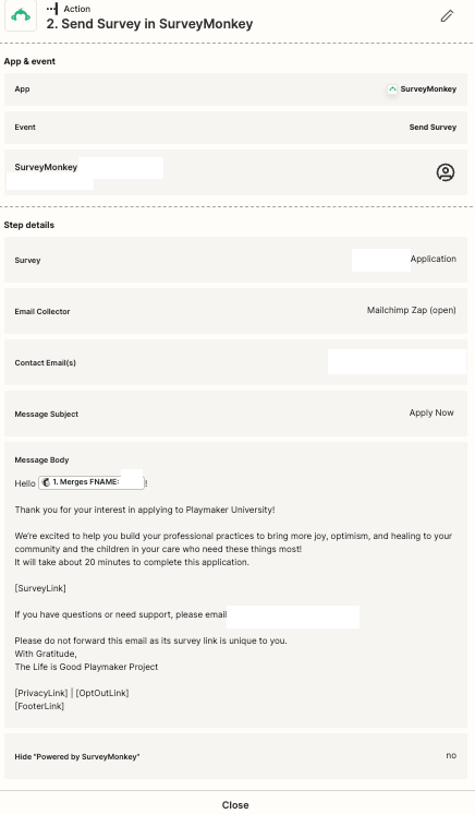
Here’s how I have this set up: 


@The Playmaker Project 

Can you show screenshots with how the Zap step is configured from the edit mode?

Need to see the field description (if any).


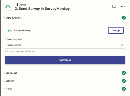
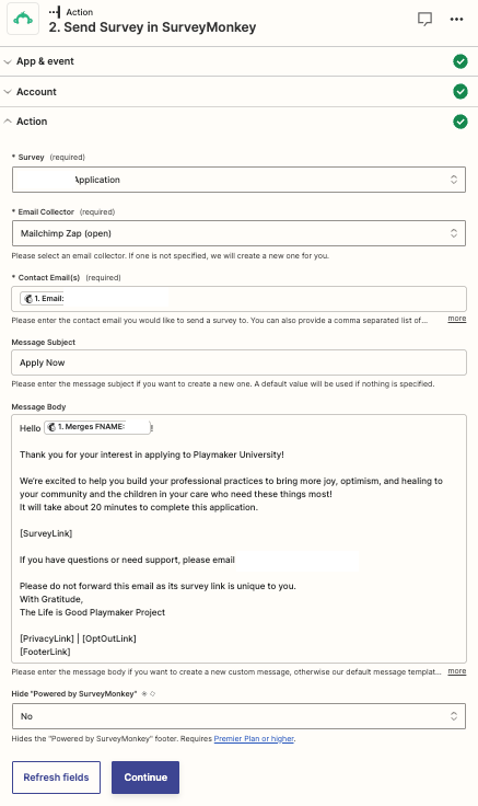
Here’s the zap edit stuff


@The Playmaker Project 

Can yo show the full field description?


@The Playmaker Project 

You can try formatting the message with HTML to see if that works.

e.g. Use the <br> tag for line breaks.


Well I feel silly now.. Thank you! that was the issue. I just wasn’t trusting that it was a true HTML email situation. 


I used w3 schools editor to help me format to HTML and now I have a beautiful email and have automated one of my coworkers daily tasks! Hooray! :) 


Thank you! 


Except my button didn’t work :( 


Hi @The Playmaker Project👋

Glad to see Troy was able to help get you pointed in the right direction!

You mentioned that the button didn’t work, can you elaborate on that further? I’m guessing the button was generated by one of the placeholder tags (e.g. SurveyLink]), is that correct?

If so, is the issue that one of the placeholders failed to display correctly? Or did the button not work when clicked or did it link through to the wrong place? 

Looking forward to hearing from you on this!


So I used HTML for the email. And visually a button appeared… but none of them were clickable


Here’s the HTML for the buttons

<button class = "button button1"a href= SurveyLink]>Apply Now</button>


<button class = "button button1"a href=aPrivacyLink]>Privacy Info</button>

<button class = "button button1"a href=aOptOutLink]>Unsubscribe</button> 

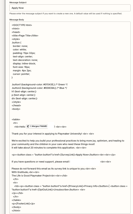
Here’s a picture of the full text for the HTML


Thanks for getting back to me with that info, @The Playmaker Project.

Hmm, it looks like the HTML surrounding the placeholders is incorrect. I would have normally just used an <a> tag to surround the text, not a <button> tag. And set the class of “button” to make the link look like a button (assuming there’s a CSS rule set up in SurveyMonkey that uses that specific class name of “button”, to apply the button styling you’d want). 

For example: 

<a class="button" href="lSurveyLink]">Apply Now</a>

<a class="button" href="lPrivacyLink]">Privacy Info</a>

<a class="button" href="lOptOutLink]">Unsubscribe</a> 

Can you try updating the code as suggested and see if that works any better?

Otherwise you might have to wrap the <a> tag around a <button> tag to get the styling right, if the class name “button” doesn’t make the link look like a button. For example: 

<a href=""SurveyLink]"><button class="button">Apply Now</button></a>

<a href="&PrivacyLink]"><button class="button">Privacy Info</button></a>

<a href="&OptOutLink]"><button class="button">Unsubscribe</button></a> 

Hope that makes sense? Keen to hear how that goes so please do keep us updated! 🙂


I so appreciate your help! You’re amazing! And you definitely helped me get closer… 


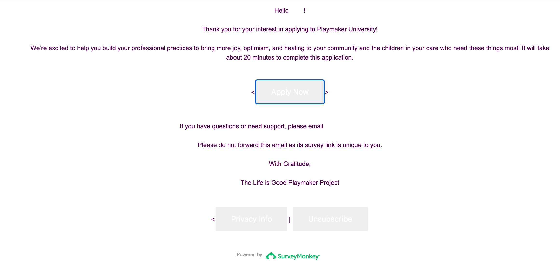
The first option got the right look… 

The second option got me clickable links 

What am I missing here? I think must be the button isn’t properly picked or something…  

<!DOCTYPE html>
<html>
<head>
<title>Page Title</title>
<style>
.button {
border: none;
color: white;
padding: 15px 32px;
text-align: center;
text-decoration: none;
display: inline-block;
font-size: 16px;
margin: 4px 2px;
cursor: pointer;
}

.button1 {background-color: #01543E;} /* Green */
.button2 {background-color: #008CBA;} /* Blue */
h1 {text-align: center;}
p {text-align: center;}
div {text-align: center;}
</style>
</head>
<body>


<table>
<tr>
<td>Hello {{203817055__merges__FNAME}}! <br><br>

Thank you for your interest in applying to Playmaker University! <br> <br>

We’re excited to help you build your professional practices to bring more joy, optimism, and healing to your community and the children in your care who need these things most!
It will take about 20 minutes to complete this application. <br><br>

<p><<a href="gSurveyLink]"><button class="button">Apply Now</button></a>><br><br></p>

If you have questions or need support, please email REDACTED <br><br>

Please do not forward this email as its survey link is unique to you.<br><br>
With Gratitude,<br><br>
The Life is Good Playmaker Project<br><br></td>
</tr>
<tr>
<td><p><<a href="gPrivacyLink]"><button class="button">Privacy Info</button></a>| <a href="aOptOutLink]"><button class="button">Unsubscribe</button></a><br>
</p></td>
</tr>
</table>
<p>&FooterLink]</p>
</body>
</html>

Should it be this?

<a href="

Or this? 

<a href="SurveyLink]"><button class="button button1">Apply Now</button></a>


Sorry for the delay here, @The Playmaker Project.

It looks like you’re really close on this! There’s just a few extra angle brackets (chevrons) that need to be removed:

46ebfb86812180e51300de48653e0a11.png
 

Looking at the CSS in the code you shared it seems that the .button1 and .button2 class names would set a different background color for the buttons. So if you want the button to be green you’d add the button1 class. For example: 

<a href="lSurveyLink]"><button class="button button1">Apply Now</button></a>


Can you try removing those extra angle brackets and add the button1 class (if desired) and let us know whether that gets the buttons appearing as desired? 


Yes Thank you! I got it to work! 🙂 Unfortunately, we have too many uses for this and no budget remaining for 2023… But I am advocating hard for a Paid account in 2024 I think my goal is to set up as many Zaps as I can and then calculate how much time I’m saving to show that it’s worth the price. 


I am grateful in your support in getting my first Zap up and running. It works like a charm! 


YAY! 🎉 I’m so pleased it’s working now. Great work here, @The Playmaker Project🙌

No worries! That sounds like a good plan to me. If you run into any issues setting up those other Zaps please do reach out for assistance in the Community again - we’re always here and happy to help! 🤗