Im new, trying to use zapier to connect an excel sheet to databox I want to graph numerics to show progress through the year. so its about 14 numbers in a row. one for each machine, each graphed weekly and id like data box to show their values. but I have no clue how to do this. zapier makes it LOOK easy but I cant get a grasp on making zaps. please help?

Best answer
Connect Excel to databox to graph numerics to show progress through the year
Best answer by Liz_Roberts
Circling back on this thread to summarize the above suggestions and help future users who may be looking for a similar workflow:
First:
- Databox doesn't use "Score" as an ID, so changing the “Metric Name” to "Score" will hide the second field/setting
- In the Value field, click the + sign drop down and choose the value from the first step ("Score")
- Fill in the Title
- For the Date/Timestamp click the plus sign and choose your date
Then:
Create 15 Databox steps in the Zap:
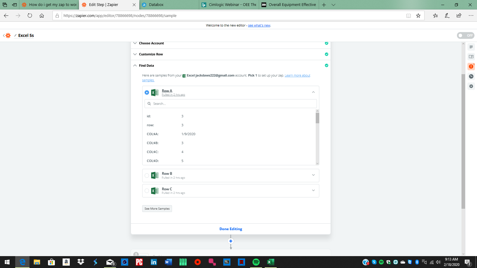
The date is always COL$A The Metric Name is always Score, the "value" and the Title changes for each machine, here's a couple of examples:
- Value: COL$B Title: Assembly
- Value: COL$C Title: Paintline
- Value: COL$D Title: 3D-Press
Do the above for each machine (15 steps), test & continue for each of those steps, then review the data in Databox to confirm it is correct.
This post has been closed for comments. Please create a new post if you need help or have a question about this topic.


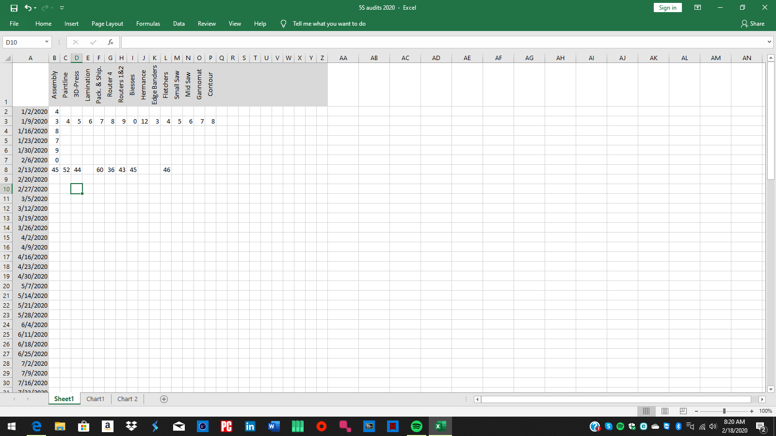 the data sheet (for this year going forward)
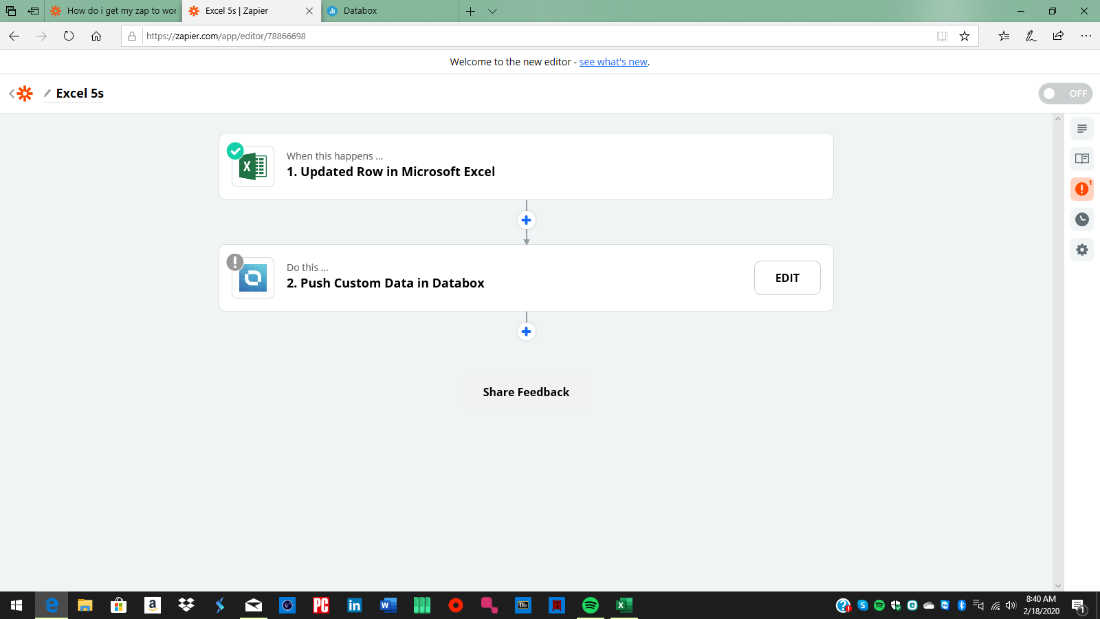
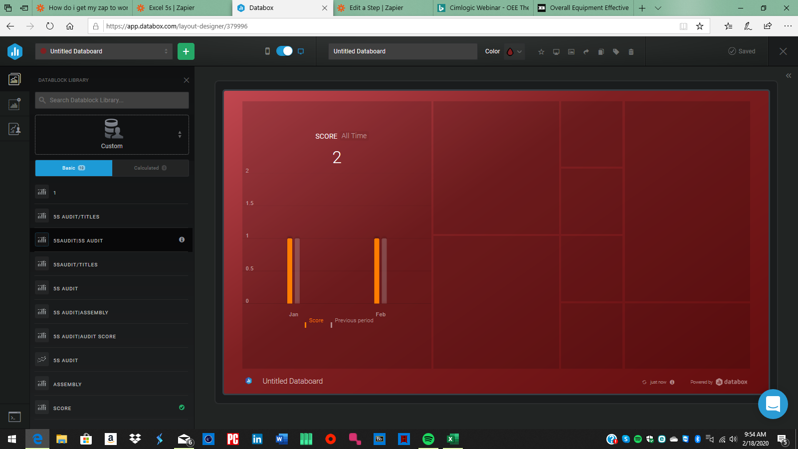
 is this what you mean? its grabbing rows and has the data from each column. that's the test data im using.
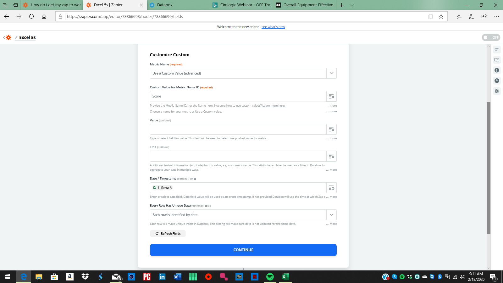
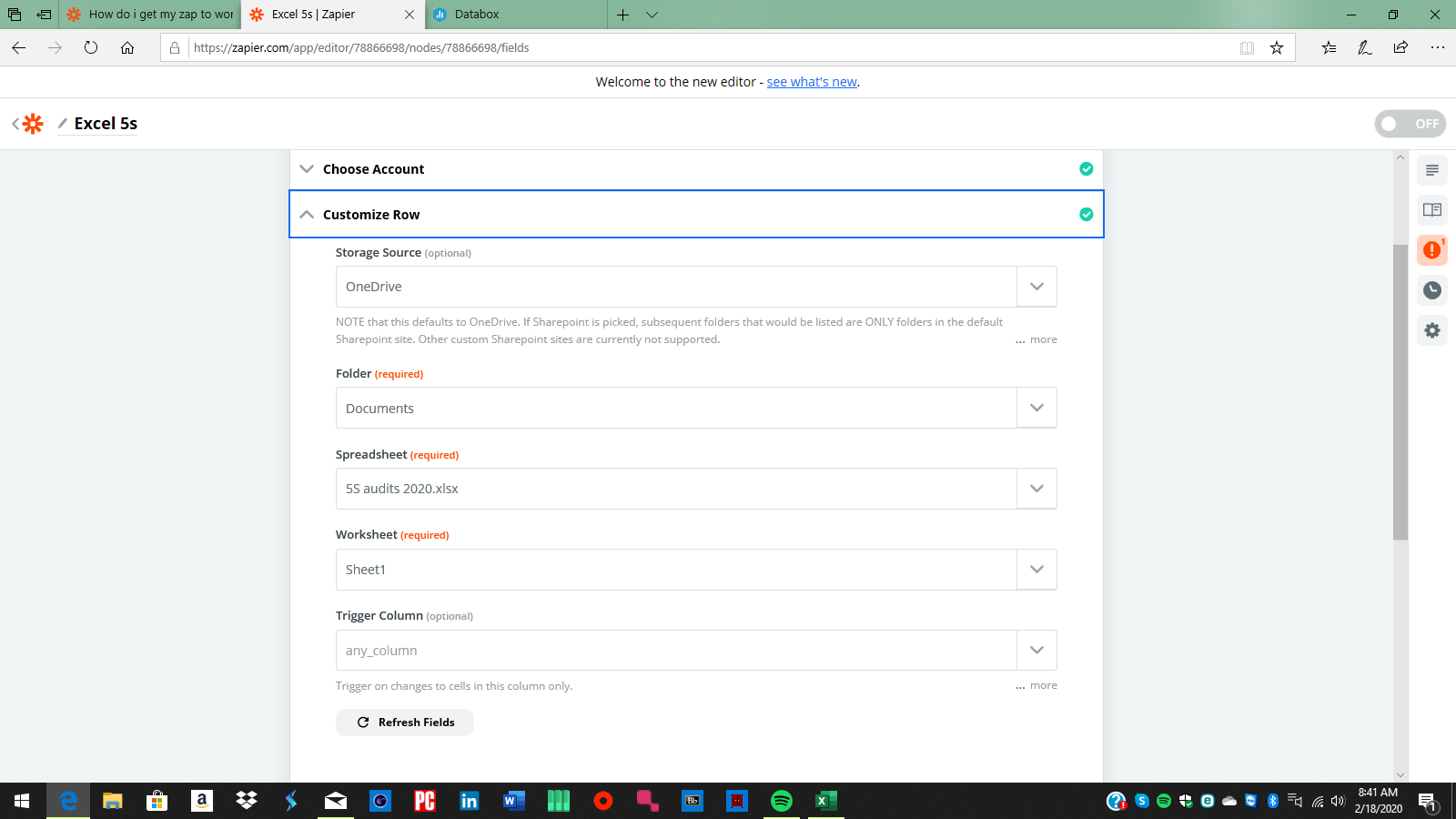
 yeah this is where I get lost I suppose
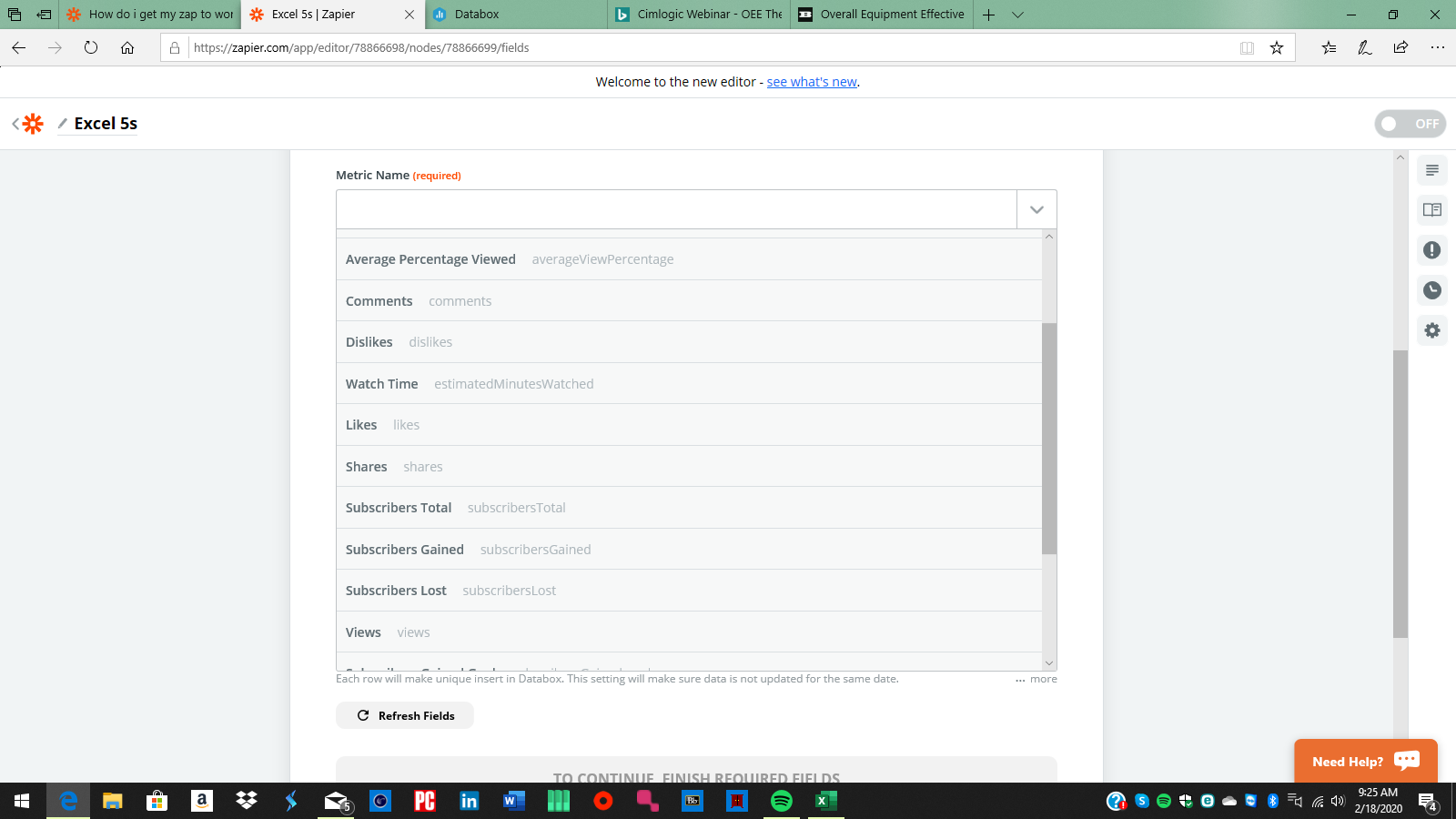
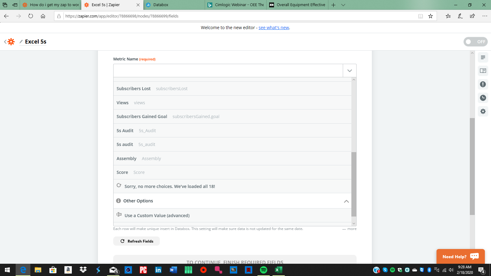
 click the plus to the right,
  And choose the value from the first step that is the Score.
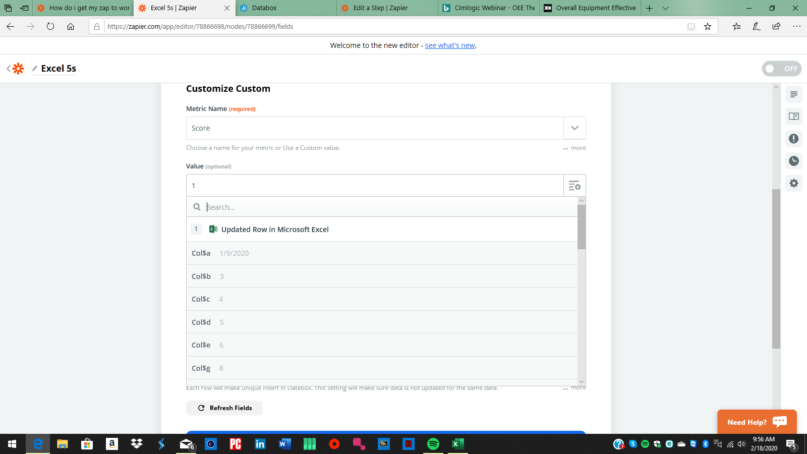
 I would think that I would use the updated row as the value? but it still wont graph the way I want. im not sure what im doing wrong.

The Zappy Awards are back
We're celebrating the Zapier builders making AI transformation happen. Winners get a published story on zapier.com, a trophy, $5,000 cash, and a feature at ZapConnect. Nominate yourself or a peer by July 24th, 2026.
Log in to the Community
No account yet? Create an account
Use your Zapier credentials
Log in with ZapierEnter your E-mail address. We'll send you an e-mail with instructions to reset your password.