Im new, trying to use zapier to connect an excel sheet to databox I want to graph numerics to show progress through the year. so its about 14 numbers in a row. one for each machine, each graphed weekly and id like data box to show their values. but I have no clue how to do this. zapier makes it LOOK easy but I cant get a grasp on making zaps. please help?
Hi
Can you tell us how far you've got? What you've got setup in Zapier already?
Feel free to include screengrabs.
ive connected to both Databox and the excel file through zapier. ive created a custom key (databox) in order to connect the flow im just unsure how to zap the data to reflect what im looking for
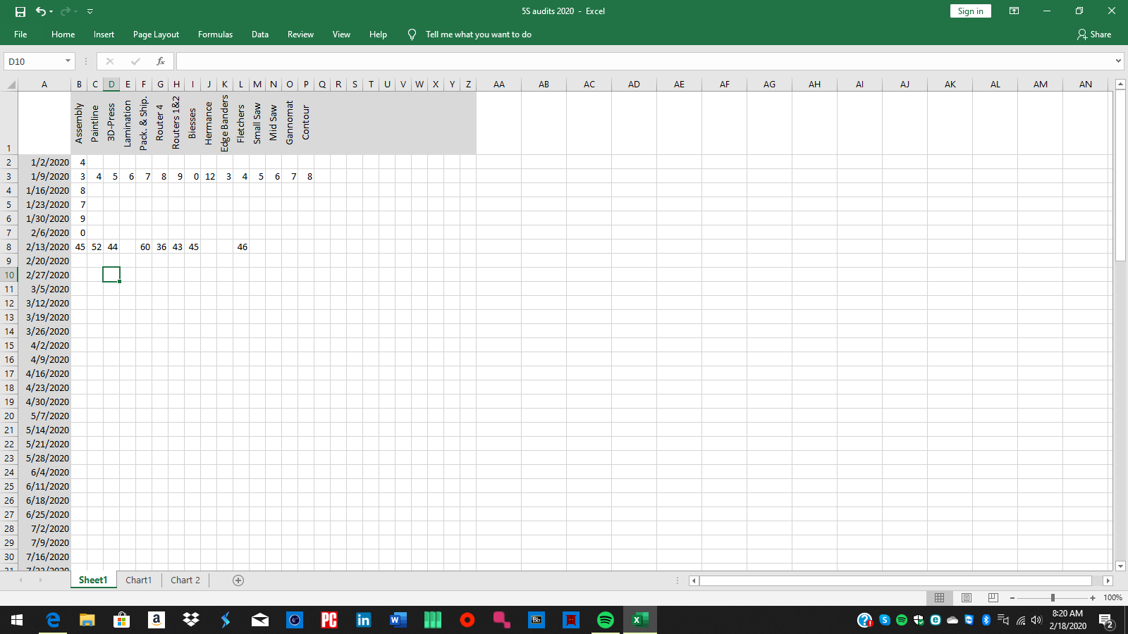
the data sheet (for this year going forward)
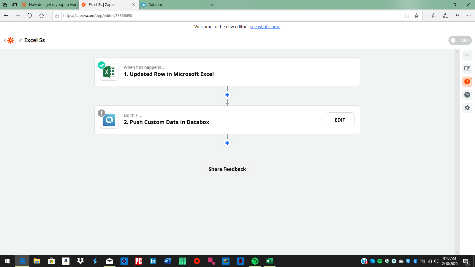
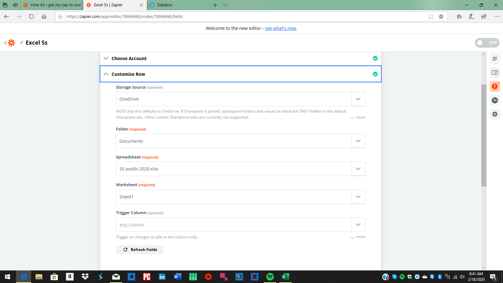
im trying to make it graph each process rating for the week so its easily viewable content. essentially the last updated integer in the file will show per process.
So
Everytime you update one of those rows, it's going to try adding data to Databox.
Have you got the Databox step setup yet? If so, can you show us that?
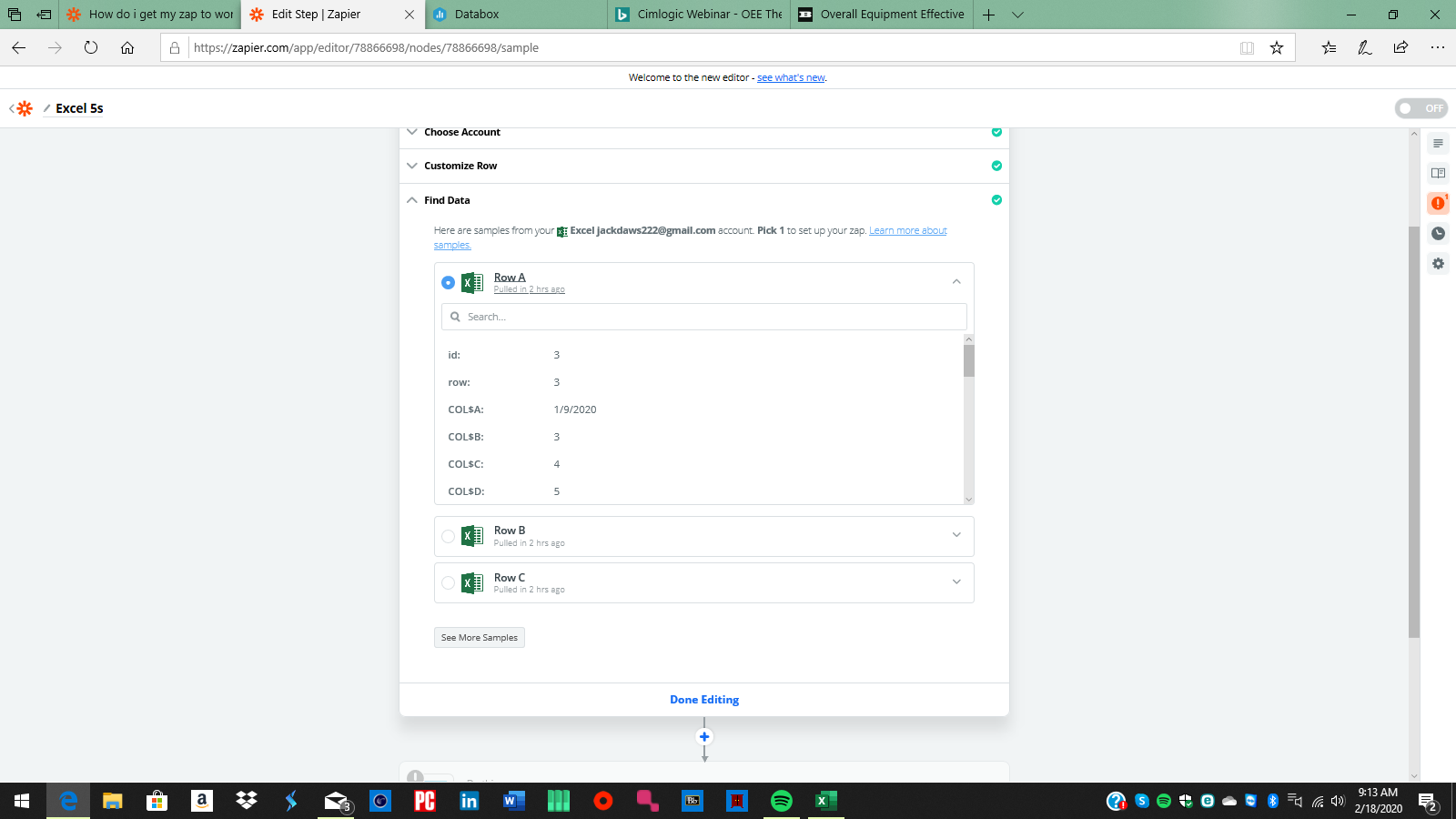
So far, what you have in step 1 is set up correctly, essentially anytime a cell in a row in that spreadsheet is updated this zap will trigger.
The question is how are you mapping those columns/cells into databox. When you get those mapped up and send a test do you get an error from databox? Or is the data showing up within databox?
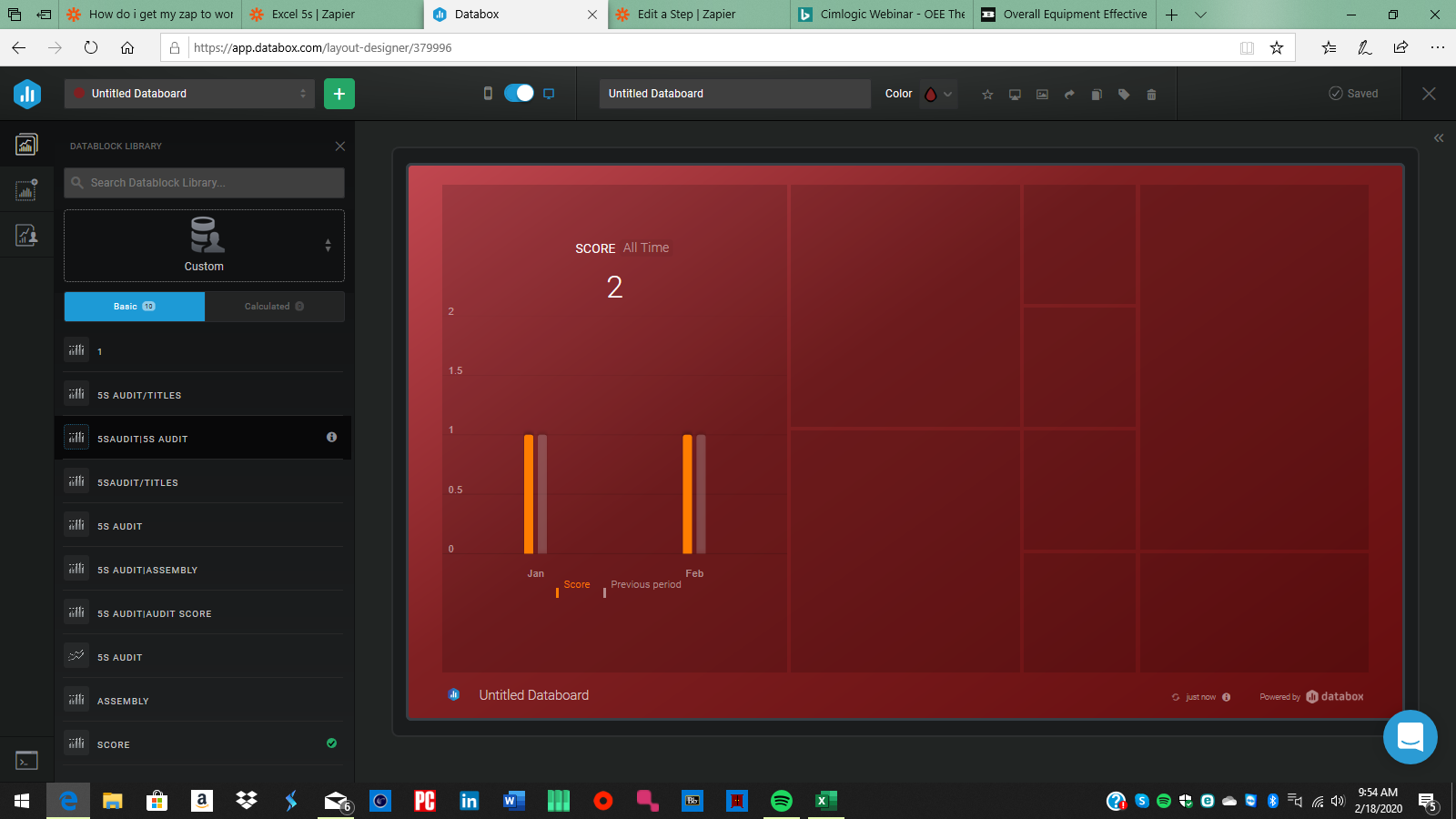
no. that's where I get lost. ive tried doing it several times. and each time when I send it out to be tested it doesn't seem to work? either it doesn't show the data at all, or it shows a number thatisnt on the sheet. and its only showing 1 value rather than 1 value for each machine. im having real trouble with it.
Okay, lets start with a screengrab of the test data from step 1... if you send the test by clicking the Test & Review button it should show you the column names and the values it received back from the spreadsheet. Send a screenshot or two of those results.
is this what you mean? its grabbing rows and has the data from each column. that's the test data im using.
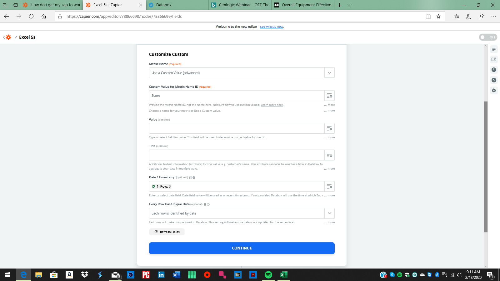
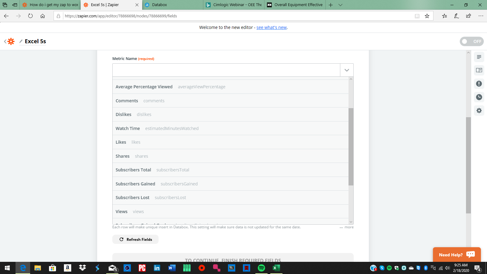
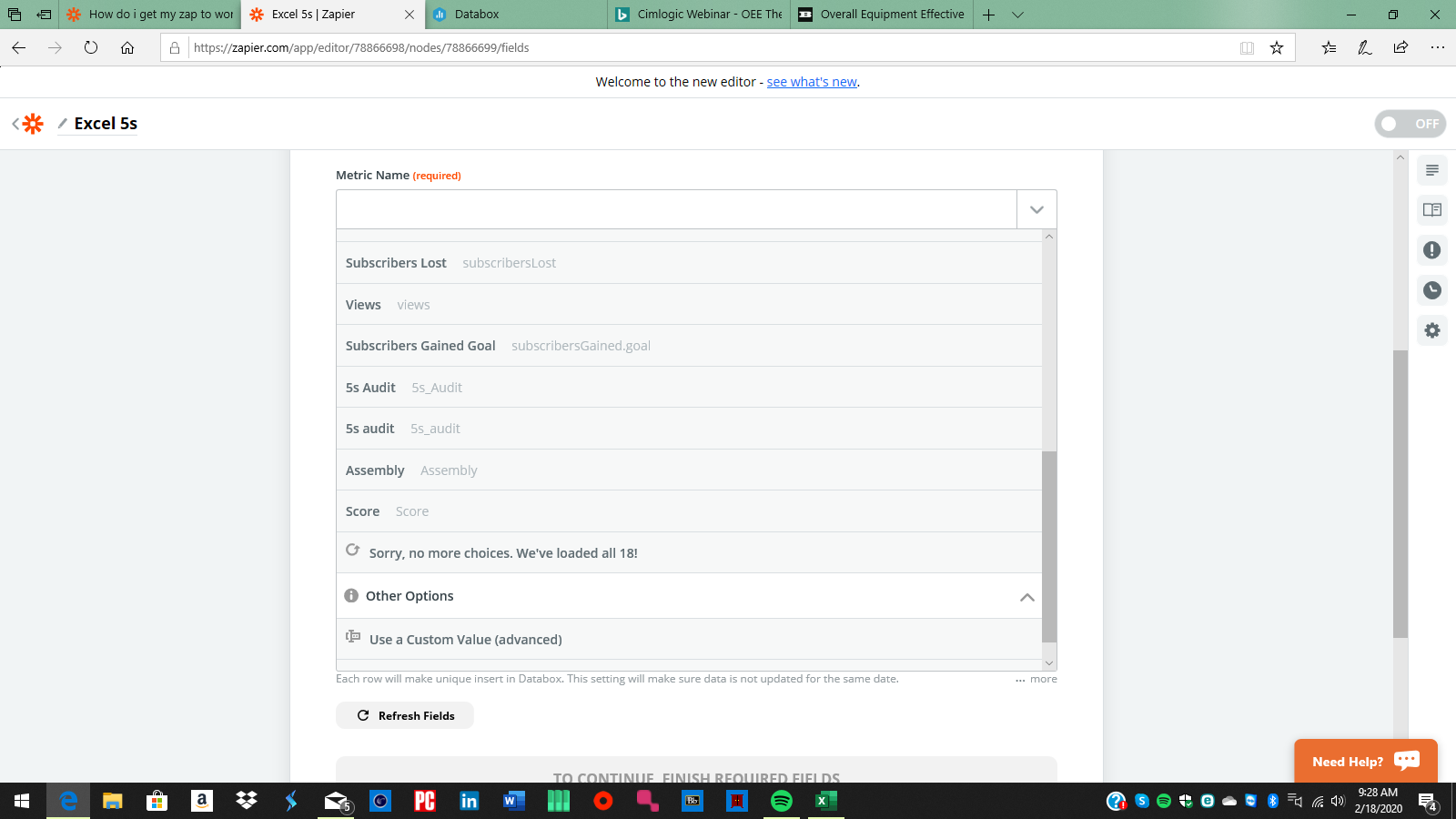
Perfect, and now a screenshot of the "customize" section of step 2 for databox.... even if all the fields are empty... I've not used databox before, so a screenshot of the customize section will help immensely in explaining what needs to go where.
Boom, the first and second setting are where the initial problem(s) are. The first field you have set to a Custom Value, and the second should be an ID, my guess is that databox doesn't use "Score" as an ID. So what if you change the first setting to "Score". It will hide the second field/setting.
Alternatively click the dropdown next to the first field and take a screenshot and post it here. That will show the Metric Names (in black/bold) and in Grey the Metric ID's.
yeah this is where I get lost I suppose
So instead of choosing a custom value, just choose "Score" in the first field.
Then in the Value field
click the plus to the right,
And choose the value from the first step that is the Score.
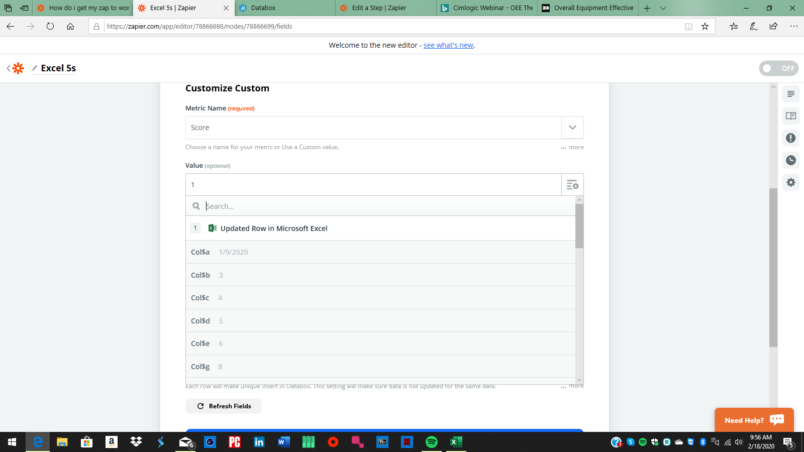
Fill in the Title if needed (I don't know how your databox is set up, this might be something you need, might not, but I'm 90% sure you need the Value.
For the Date/Timestamp, remove what you have in there and click the plus and choose the COL$A (1/9/2020) to go in there.
I'm not sure about the last setting, but it is optional, so I would clear the current choice and see what happens.
Do a Test & Review and see what data shows up in Databox.
I would think that I would use the updated row as the value? but it still wont graph the way I want. im not sure what im doing wrong.
Well, now you've got data flowing into databox... so half the battle is taken care of.
What we need to know now is what were you expecting to see? we only put one data element (one score from one day) in there. We would also need to put the Scores from the other days and the other machines and any other values you need in databox.
If the row in the spreadsheet has 5 values, then you would need 5 databox steps, one for each value that you want to put in Databox.
correct. so essentially I want the view to be weekly, 1 set of numbers per machine graphed. so if there is 15 machines I should get 15 bars graphed essentially. im unsure how to do this firstly. but secondly whats being graphed isnt correct.
This might be a better question for Databox then, as the Zap is working and it's more about how the data needs to be pushed into Databox...
As I'm looking deeper into the spreadsheet, Perhaps Title should be the machine name, so Databox has 15 Scores for each date...
Here's what I would do next to test this:
Create 15 Databox steps in the zap, The date is always COL$A The Metric Name is always Score, the "value" and the Title changes for each machine, here's a couple of examples:
- Value: COL$B Title: Assembly
- Value: COL$C Title: Paintline
- Value: COL$D Title: 3D-Press
Do that for each machine (15 steps) and then test & continue for each of those steps, then look at the data in databox and see if it's closer to what you're aiming for.
I'm basing this on the help text that Databox has listed below the "Title" field in their Zapier integration. "This attribute can later be used as a filter in Databox to aggregate your data in multiple ways."
But like I said, this is now not so much a Zapier problem as a understanding how to store data within Databox... and that is why this whole thing was more complicated than you expected. Databox is very flexible which makes it a bit of a challenge knowing how to get the data in there correctly.
Circling back on this thread to summarize the above suggestions and help future users who may be looking for a similar workflow:
First:
- Databox doesn't use "Score" as an ID, so changing the “Metric Name” to "Score" will hide the second field/setting
- In the Value field, click the + sign drop down and choose the value from the first step ("Score")
- Fill in the Title
- For the Date/Timestamp click the plus sign and choose your date
Then:
Create 15 Databox steps in the Zap:
The date is always COL$A The Metric Name is always Score, the "value" and the Title changes for each machine, here's a couple of examples:
- Value: COL$B Title: Assembly
- Value: COL$C Title: Paintline
- Value: COL$D Title: 3D-Press
Do the above for each machine (15 steps), test & continue for each of those steps, then review the data in Databox to confirm it is correct.
Enter your E-mail address. We'll send you an e-mail with instructions to reset your password.