



You may have noticed that the “My Zap workflows” page looks a little different.
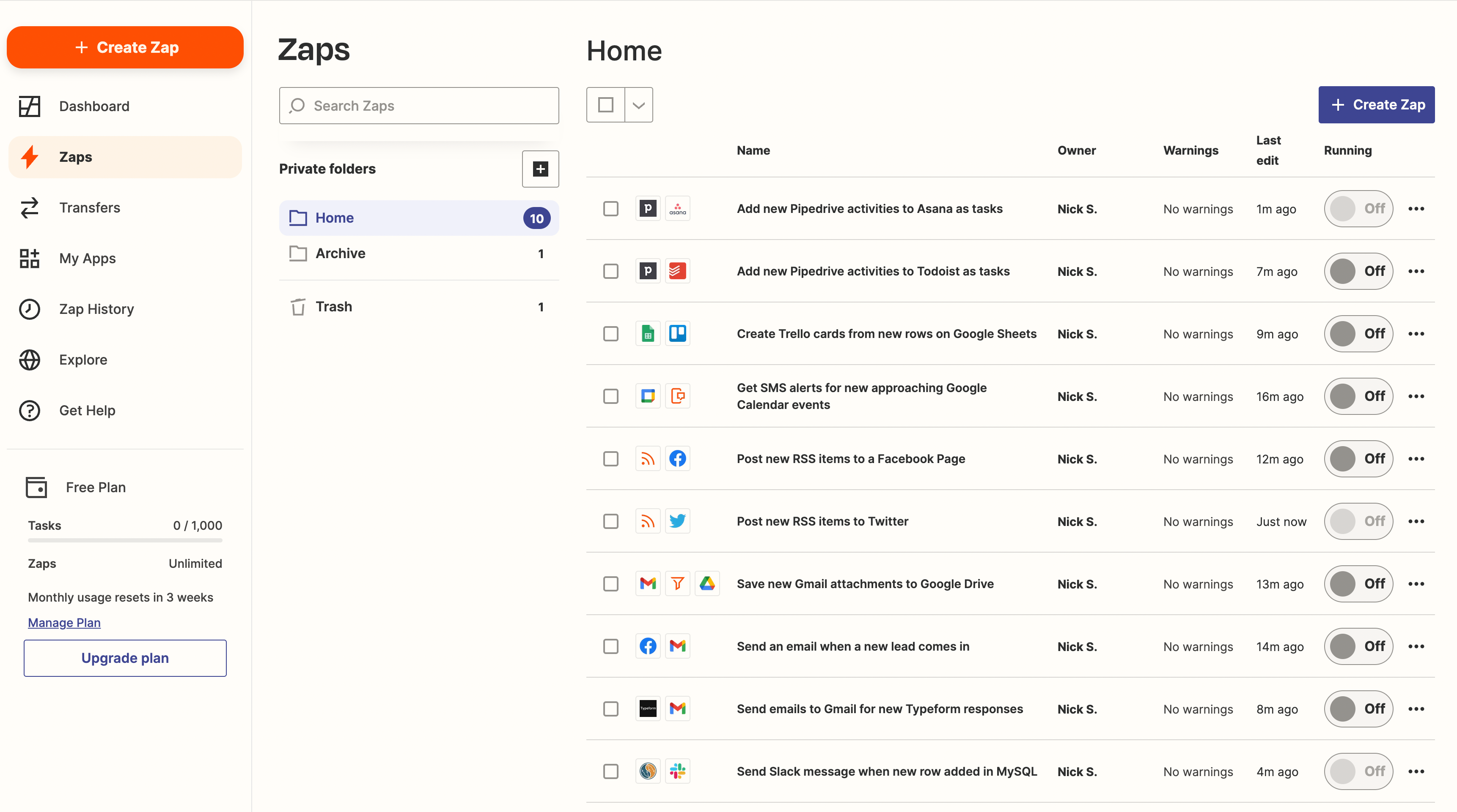
We've replaced the card-like representation of Zap workflows, with a table view. The goal is to make more efficient use of space by providing all of the same information with less whitespace.
How much of a difference does this make?
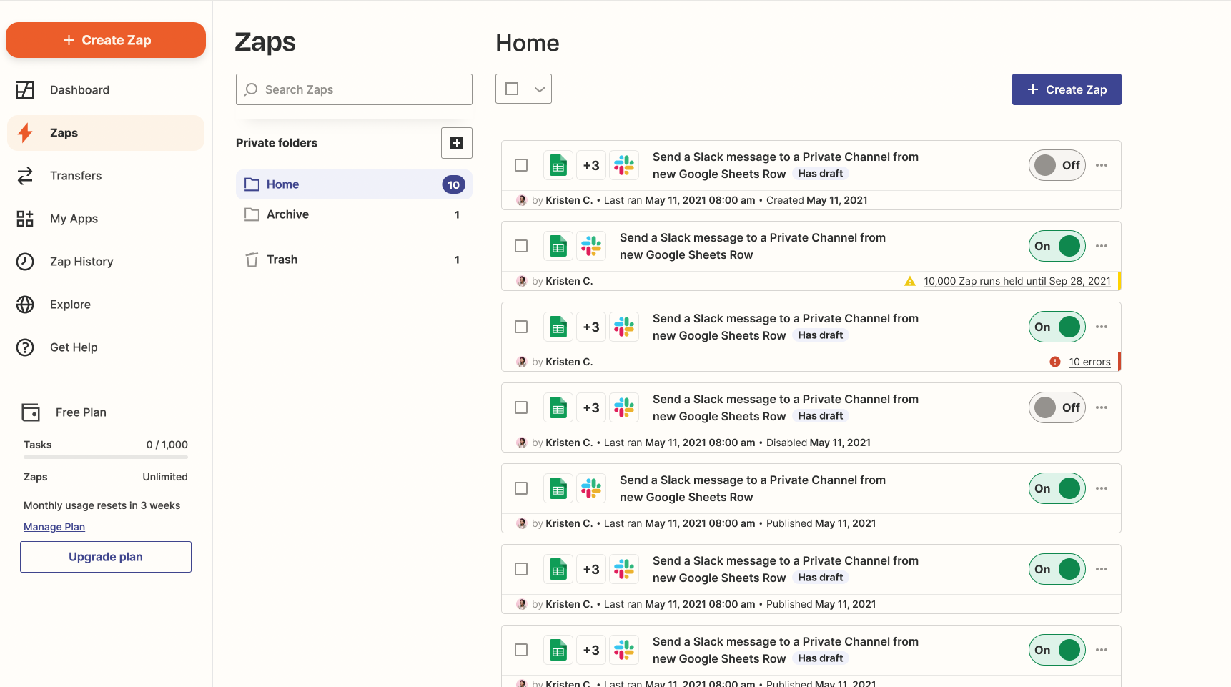
Using my standard 16in MacBook Pro to look at my Home folder, I can see 40% more Zap workflows without any scrolling.
Before
I can see almost 7 Zap workflows here with the card-style view.
After
I can see 10 Zap workflows here without having to scroll. Information is presented in a more compact manner. See more, scroll less.
This is just the beginning of the improvements we’ll be making to this page :) Stay tuned for more updates!