I think there is bad UX on the new UI specifically on the zoom element
Normally the zoom should be [ - ] [ 100%] [ + ] but in Zapier is [ + ] [ 100% ] [ - ]
I think this is bad UX. Maybe someone and Zapier can fix it?

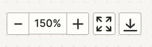
I think there is bad UX on the new UI specifically on the zoom element
Normally the zoom should be [ - ] [ 100%] [ + ] but in Zapier is [ + ] [ 100% ] [ - ]
I think this is bad UX. Maybe someone and Zapier can fix it?

We're celebrating the Zapier builders making AI transformation happen. Winners get a published story on zapier.com, a trophy, $5,000 cash, and a feature at ZapConnect. Nominate yourself or a peer by July 24th, 2026.
No account yet? Create an account
Enter your E-mail address. We'll send you an e-mail with instructions to reset your password.