
Hi folks, I’m Chris Geoghegan, a Lead Product Manager here at Zapier.
I'm excited to tell you about some of the improvements we're making to our navigation! In brief, the navigation will take up a lot less space on desktop devices and will be much easier to use on mobile devices.
You can expect to see these changes rolling out in the next couple weeks. Some of you may even see the new navigation now. Here's a preview of what to expect...
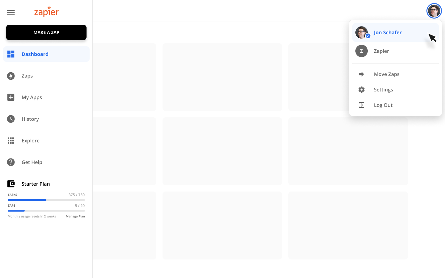 The primary navigation has been consolidated into a single, vertical menu on the left side of your screen. You can expand and collapse this menu, giving you a lot more space to work. If you belong to multiple accounts, you can switch between those accounts in the upper right corner. Your current task usage is visible directly in the left-hand navigation.
 Left: default menu view, center: Primary Menu Expanded, right: Account Menu Expanded
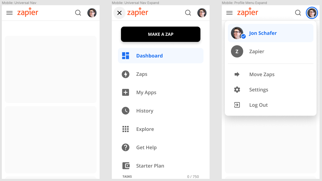
We've significantly reduced the amount of space navigation takes up on your mobile device while also making it easier to use.
Let me know if you have any questions or feedback!
